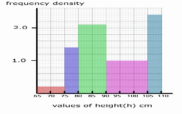
A histogram is a type bar chart using intervals on the x -axis, with the modification that the interval sizes are not fixed. The frequencies are defined by the areas of the bars, and the y – axis is not a frequency axis, but a frequency density axis. A histogram is better able to represent data because it can be used where the data is irregularly grouped. The heights of a group of fictitious children are summarised in the table below.
|
Height |
Frequency |
|
65 – 75 |
2 |
|
75 – 80 |
7 |
|
80 – 90 |
21 |
|
90 – 105 |
15 |
|
105 – 110 |
12 |
We construct a Frequency Density Column, using![]() obtaining the table
obtaining the table
|
Height |
Frequency |
Frequency Density |
|
65 – 75 |
2 |
2/10 = 0.2 |
|
75 – 80 |
7 |
7/5 = 1.4 |
|
80 – 90 |
21 |
21/10 = 2.1 |
|
90 – 105 |
15 |
15/15 = 1.0 |
|
105 – 110 |
12 |
12/5 = 2.4 |
We can now draw the histogram.

