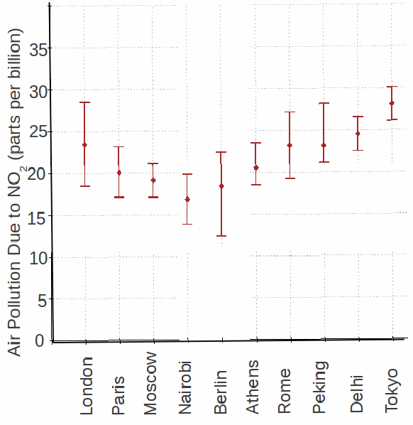
It can be hard to compare values of quantities taken at different places or different times, especially
when there are many comparisons. It helps to draw a graph. The graph below shows concentrations of![]() air pollution in different cities. The vertical bars are the ranges of readings for each city and reflect the fact that the readings are not exact.
air pollution in different cities. The vertical bars are the ranges of readings for each city and reflect the fact that the readings are not exact.

The range of values for London overlaps with the range for Paris so the pollution in London is not significantly different from that in Paris. On the other hand, the range of values for Nairobi does not overlap with the range of values for Tokyo, so we can be sure that pollution is less in Nairobi than in Tokyo.
