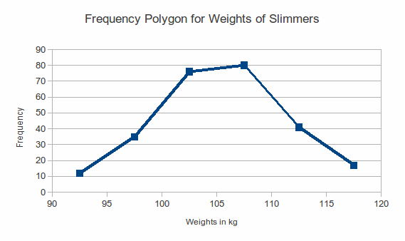
Frequency polygons show the same information as bar charts, with points joined by lines instead of with vertical bars. Suppose we need to draw a frequency polygon for the data in the table below which contains information about the weights of some ambitious slimmers.
|
Weight, |
Frequency |
|
|
12 |
|
|
35 |
|
|
76 |
|
|
80 |
|
|
41 |
|
|
17 |
The frequency polygon is:
Notice that the points are plotted as (midpoint of weight interval, frequency).
