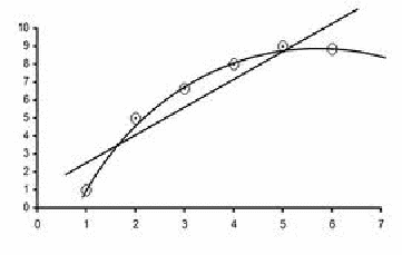
Graphs allow us to better identify relationships and trends. When plotting graphs, the following should be remembered:
-
The graph should have a descriptive title and if needed, a key.
-
The scales should be suitable and regular, either linear or log for example. There should be no sudden jumps in values.
-
Consider whether or not to include the origin. The data should take up most of the graph, and if including the origin makes this impossible, it should be excluded. Often the y intercept needs to be found, and in this case the y axis needs to be included at least in part.
-
The axes are labelled with the correct quantity and units e.g. Current (A).
-
The points are labelled clearly. Vertical and horizontal lines are better than crosses or dots. If error bars are to be drawn then vertical and horizontal bars are the only option.
-
A best fit trend line is added (or even a curve). The line (or curve) should not just join the dots. If it is a line it should go through the centre of the points, with as many points below the line as above, if possible and should be drawn with a ruler. If it is a curve it should be smooth.
-
The points should be randomly above and below the line (or curve). If this cannot be done with a line, a curve may be a better fit, as below.

-
Outliers or extreme values, that do not fit the line or curve are identified.
