Suppose we have n observations![]() – which we assume are in ascending order - and we want to know whether they could have arisen from a normal distribution. We plot the data points against the corresponding standard normal quantiles
– which we assume are in ascending order - and we want to know whether they could have arisen from a normal distribution. We plot the data points against the corresponding standard normal quantiles![]() given by
given by![]() for
for![]() If the data is from a normal population then the points
If the data is from a normal population then the points![]() should lie approximately on a straight line. This is called a normal probability plot and is especially suited to small data sets.
should lie approximately on a straight line. This is called a normal probability plot and is especially suited to small data sets.
Example:
We have some silver coins from ancient Byzantine. We want to test whether the % silver content follows a normal distribution.
|
5.9 |
6.8 |
6.4 |
7 |
6.6 |
7.7 |
7.2 |
6.9 |
6.2 |
First arrange the data in order.
|
5.9 |
6.2 |
6.4 |
6.6 |
6.8 |
6.9 |
7 |
7.2 |
7.7 |
Now find the quantiles:![]() etc.
etc.
|
|
1 |
2 |
3 |
4 |
5 |
6 |
7 |
8 |
9 |
|
|
5.9 |
6.2 |
6.4 |
6.6 |
6.8 |
6.9 |
7 |
7.2 |
7.7 |
|
|
0.1 |
0.2 |
0.3 |
0.4 |
0.5 |
0.6 |
0.7 |
0.8 |
0.9 |
|
|
-1.282 |
-0.842 |
-0.524 |
-0.253 |
0.000 |
0.253 |
0.524 |
0.842 |
1.282 |
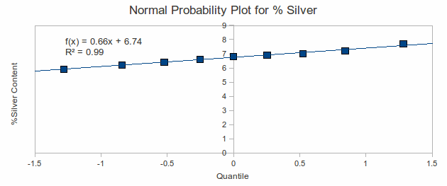
Plot the points![]()

The correlation coefficient (![]() ) indicates a very good fit to a straight line, hence we may take the silver content as normally distributed.
) indicates a very good fit to a straight line, hence we may take the silver content as normally distributed.
